H5页面解决iPhoneX适配刘海问题
日期:2019-04-30
来源:程序思维浏览:4598次
这几天在用h5开发app,遇到了iphoneX适配的问题,其实解决这个问题很简单,让我们来看一下如何解决吧?
1. iPhoneX的介绍
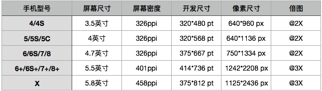
屏幕尺寸
我们熟知的iPhone系列开发尺寸概要如下:
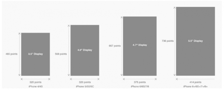
△ iPhone各机型的开发尺寸
转化成我们熟知的像素尺寸:
△ 每个机型的多维度尺寸
倍图其实就是像素尺寸和开发尺寸的倍率关系,但这只是外在的表现。倍图核心的影响因素在于PPI(DPI),了解屏幕密度与各尺寸的关系有助于我们深度理解倍率的概念。
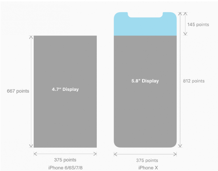
iPhone8在本次升级中,屏幕尺寸和分辨率都遗传了iPhone6以后的优良传统;
然而iPhone X 无论是在屏幕尺寸、分辨率、甚至是形状上都发生了较大的改变,下面以iPhone 8作为参照物,看看到底iPhone X的适配我们要怎么考虑。
我们看看iPhone X尺寸上的变化:
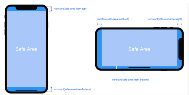
2. iPhoneX的适配---安全区域(safe area)
苹果对于 iPhone X 的设计布局意见如下:
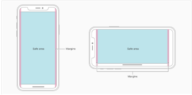
核心内容应该处于 Safe area 确保不会被设备圆角(corners),传感器外壳(sensor housing,齐刘海) 以及底部的 Home Indicator 遮挡。也就是说 我们设计显示的内容应该尽可能的在安全区域内;
3. iPhoneX的适配---适配方案viewport-fit
3.1 PhoneX的适配,在iOS 11中采用了viewport-fit的meta标签作为适配方案;viewport-fit的默认值是auto。
viewport-fit取值如下:
auto 默认:viewprot-fit:contain;页面内容显示在safe area内
cover viewport-fit:cover,页面内容充满屏幕
viewport-fit meta标签设置(cover时)
<meta name="viewport" content="width=device-width,initial-scale=1.0, minimum-scale=1.0, maximum-scale=1.0, user-scalable=no, viewport-fit=cover">
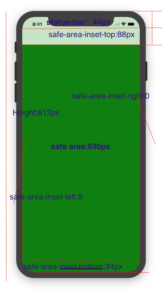
3.2 css constant()函数 与safe-area-inset-top & safe-area-inset-left & safe-area-inset-right & safe-area-inset-bottom的介绍
如上图所示 在iOS 11中的WebKit包含了一个新的CSS函数constant(),以及一组四个预定义的常量:safe-area-inset-left, safe-area-inset-right, safe-area-inset-top和 safe-area-inset-bottom。当合并一起使用时,允许样式引用每个方面的安全区域的大小。
3.1当我们设置viewport-fit:contain,也就是默认的时候时;设置safe-area-inset-left, safe-area-inset-right, safe-area-inset-top和 safe-area-inset-bottom等参数时不起作用的。
3.2当我们设置viewport-fit:cover时:设置如下
body {
padding-top: constant(safe-area-inset-top); //为导航栏+状态栏的高度 88px
padding-left: constant(safe-area-inset-left); //如果未竖屏时为0
padding-right: constant(safe-area-inset-right); //如果未竖屏时为0
padding-bottom: constant(safe-area-inset-bottom);//为底下圆弧的高度 34px
}
4. iPhoneX的适配---高度统计
viewport-fit:cover + 导航栏
5.iPhoneX的适配---媒体查询
注意这里采用的是690px(safe area高度),不是812px;
@media only screen and (width: 375px) and (height: 690px){
body {
background: blue;
}
}
6.iphoneX viewport-fit 问题总结
1.关于iphoneX 页面使用了渐变色时;如果viewport-fit:cover;
1.1在设置了背景色单色和渐变色的区别,如果是单色时会填充整个屏幕,如果设置了渐变色 那么只会更加子元素的高度去渲染;而且页面的高度只有690px高度,上面使用了padding-top:88px;
body固定为:
<body><div class="content">this is subElement</div></body>
1.单色时:
* {
padding: 0;
margin: 0;
}
body {
background:green;
padding-top: constant(safe-area-inset-top); //88px
/*padding-left: constant(safe-area-inset-left);*/
/*padding-right: constant(safe-area-inset-right);*/
/*padding-bottom: constant(safe-area-inset-bottom);*/
}
2.渐变色
* {
padding: 0;
margin: 0;
}
body {
background:-webkit-gradient(linear, 0 0, 0 bottom, from(#ffd54f), to(#ffaa22));
padding-top: constant(safe-area-inset-top); //88px
/*padding-left: constant(safe-area-inset-left);*/
/*padding-right: constant(safe-area-inset-right);*/
/*padding-bottom: constant(safe-area-inset-bottom);*/
}
解决使用渐变色 仍旧填充整个屏幕的方法;CSS设置如下
<!DOCTYPE html>
<html>
<head>
<meta name="viewport" content="initial-scale=1, viewport-fit=cover">
<title>Designing Websites for iPhone X: Respecting the safe areas</title>
<style> * {
padding: 0;
margin: 0;
}
html, body {
height: 100%;
}
body {
padding-top: constant(safe-area-inset-top);
padding-left: constant(safe-area-inset-left);
padding-right: constant(safe-area-inset-right);
padding-bottom: constant(safe-area-inset-bottom);
}
.content {
background: -webkit-gradient(linear, 0 0, 0 bottom, from(#ffd54f), to(#ffaa22));
width: 100%;
height: 724px;
} </style>
</head>
<body>
<div class="content">this is subElement</div>
</body>
</html>
2.页面元素使用了固定定位的适配即:{position:fixed;}
2.1 子元素页面固定在底部时;使用viewport-fit:contain时;可以看到bottom:0时只会显示在安全区域内;
<!DOCTYPE html>
<html>
<head>
<meta name="viewport" content="initial-scale=1">
<!--<meta name="viewport" content="initial-scale=1, viewport-fit=cover">-->
<title>Designing Websites for iPhone X: Respecting the safe areas</title>
<style>
* {
padding: 0;
margin: 0;
}
/*html,body {*/
/*height: 100%;*/
/*}*/
body {
background: grey;
/*padding-top: constant(safe-area-inset-top);*/
/*padding-left: constant(safe-area-inset-left);*/
/*padding-right: constant(safe-area-inset-right);*/
/*padding-bottom: constant(safe-area-inset-bottom);*/
}
.top {
width: 100%;
height: 44px;
background: purple;
}
.bottom {
position: fixed;
bottom: 0;
left: 0;
right: 0;
height: 44px;
color: black;
background: green;
}
</style>
</head>
<body>
<div class="top">this is top</div>
<div class="bottom">this is bottom</div>
</body>
</html>
2.1 子元素页面固定在底部时;使用viewport-fit:cover时;可以看到bottom:0时只会显示在安全区域内;
* {
padding: 0;
margin: 0;
}
/*html,body {*/
/*height: 100%;*/
/*}*/
body {
background: grey;
padding-top: constant(safe-area-inset-top);
/*padding-left: constant(safe-area-inset-left);*/
/*padding-right: constant(safe-area-inset-right);*/
/*padding-bottom: constant(safe-area-inset-bottom);*/
}
.top {
width: 100%;
height: 44px;
background: purple;
}
.bottom {
position: fixed;
bottom: 0;
left: 0;
right: 0;
height: 44px;
color: black;
background: green;
}
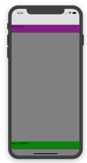
添加html,body {width:100%;heigth:100%}
图1:
* {
padding: 0;
margin: 0;
}
html,body {
height: 100%;
}
body {
background: grey;
padding-top: constant(safe-area-inset-top);
padding-left: constant(safe-area-inset-left);
padding-right: constant(safe-area-inset-right);
padding-bottom: constant(safe-area-inset-bottom);
}
.top {
width: 100%;
height: 44px;
background: purple;
}
.bottom {
position: fixed;
bottom: 0;
left: 0;
right: 0;
height: 44px;
color: black;
background: green;
}
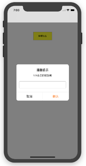
2.3 关于alertView弹框 遮罩层的解决方案
<!DOCTYPE html>
<html lang="en">
<head>
<meta charset="UTF-8">
<!--<meta name="viewport" content="width=device-width, initial-scale=1.0, minimum-scale=1.0, maximum-scale=1.0, user-scalable=no">-->
<meta name="viewport" content="width=device-width,initial-scale=1.0, minimum-scale=1.0, maximum-scale=1.0, user-scalable=no, viewport-fit=cover">
<meta http-equiv="pragma" content="no-cache">
<meta http-equiv="cache-control" content="no-cache">
<meta http-equiv="expires" content="0">
<title>alertView</title>
<script data-res="eebbk">
document.documentElement.style.fontSize = window.screen.width / 7.5 + 'px';
</script>
<style>
* {
margin: 0;
padding: 0;
}
html,body {
width: 100%;
height: 100%;
}
body {
font-size: 0.32rem;
padding-top: constant(safe-area-inset-top);
padding-left: constant(safe-area-inset-left);
padding-right: constant(safe-area-inset-right);
padding-bottom: constant(safe-area-inset-bottom);
}
.content {
text-align: center;
}
.testBut {
margin: 50px auto;
width: 100px;
height: 44px;
border: 1px solid darkgray;
outline:none;
user-select: none;
background-color: yellow;
}
</style>
<link href="alertView.css" rel="stylesheet" type="text/css">
</head>
<body>
<section class="content">
<button class="testBut" onclick="showLoading()">弹框加载</button>
</section>
<script type="text/javascript" src="alertView.js"></script>
<script>
function showLoading() {
UIAlertView.show({
type:"input",
title:"温馨提示", //标题
content:"VIP会员即将到期", //获取新的
isKnow:false
});
var xx = new UIAlertView();
console.log(xx);
}
</script>
</body>
</html>
1. iPhoneX的介绍
屏幕尺寸
我们熟知的iPhone系列开发尺寸概要如下:
△ iPhone各机型的开发尺寸
转化成我们熟知的像素尺寸:
△ 每个机型的多维度尺寸
倍图其实就是像素尺寸和开发尺寸的倍率关系,但这只是外在的表现。倍图核心的影响因素在于PPI(DPI),了解屏幕密度与各尺寸的关系有助于我们深度理解倍率的概念。
iPhone8在本次升级中,屏幕尺寸和分辨率都遗传了iPhone6以后的优良传统;
然而iPhone X 无论是在屏幕尺寸、分辨率、甚至是形状上都发生了较大的改变,下面以iPhone 8作为参照物,看看到底iPhone X的适配我们要怎么考虑。
我们看看iPhone X尺寸上的变化:
2. iPhoneX的适配---安全区域(safe area)
苹果对于 iPhone X 的设计布局意见如下:
核心内容应该处于 Safe area 确保不会被设备圆角(corners),传感器外壳(sensor housing,齐刘海) 以及底部的 Home Indicator 遮挡。也就是说 我们设计显示的内容应该尽可能的在安全区域内;
3. iPhoneX的适配---适配方案viewport-fit
3.1 PhoneX的适配,在iOS 11中采用了viewport-fit的meta标签作为适配方案;viewport-fit的默认值是auto。
viewport-fit取值如下:
auto 默认:viewprot-fit:contain;页面内容显示在safe area内
cover viewport-fit:cover,页面内容充满屏幕
viewport-fit meta标签设置(cover时)
<meta name="viewport" content="width=device-width,initial-scale=1.0, minimum-scale=1.0, maximum-scale=1.0, user-scalable=no, viewport-fit=cover">
3.2 css constant()函数 与safe-area-inset-top & safe-area-inset-left & safe-area-inset-right & safe-area-inset-bottom的介绍
如上图所示 在iOS 11中的WebKit包含了一个新的CSS函数constant(),以及一组四个预定义的常量:safe-area-inset-left, safe-area-inset-right, safe-area-inset-top和 safe-area-inset-bottom。当合并一起使用时,允许样式引用每个方面的安全区域的大小。
3.1当我们设置viewport-fit:contain,也就是默认的时候时;设置safe-area-inset-left, safe-area-inset-right, safe-area-inset-top和 safe-area-inset-bottom等参数时不起作用的。
3.2当我们设置viewport-fit:cover时:设置如下
body {
padding-top: constant(safe-area-inset-top); //为导航栏+状态栏的高度 88px
padding-left: constant(safe-area-inset-left); //如果未竖屏时为0
padding-right: constant(safe-area-inset-right); //如果未竖屏时为0
padding-bottom: constant(safe-area-inset-bottom);//为底下圆弧的高度 34px
}
4. iPhoneX的适配---高度统计
viewport-fit:cover + 导航栏
5.iPhoneX的适配---媒体查询
注意这里采用的是690px(safe area高度),不是812px;
@media only screen and (width: 375px) and (height: 690px){
body {
background: blue;
}
}
6.iphoneX viewport-fit 问题总结
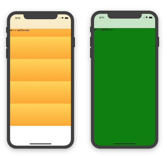
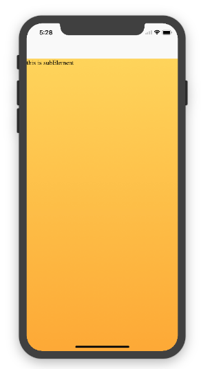
1.关于iphoneX 页面使用了渐变色时;如果viewport-fit:cover;
1.1在设置了背景色单色和渐变色的区别,如果是单色时会填充整个屏幕,如果设置了渐变色 那么只会更加子元素的高度去渲染;而且页面的高度只有690px高度,上面使用了padding-top:88px;
body固定为:
<body><div class="content">this is subElement</div></body>
1.单色时:
* {
padding: 0;
margin: 0;
}
body {
background:green;
padding-top: constant(safe-area-inset-top); //88px
/*padding-left: constant(safe-area-inset-left);*/
/*padding-right: constant(safe-area-inset-right);*/
/*padding-bottom: constant(safe-area-inset-bottom);*/
}
2.渐变色
* {
padding: 0;
margin: 0;
}
body {
background:-webkit-gradient(linear, 0 0, 0 bottom, from(#ffd54f), to(#ffaa22));
padding-top: constant(safe-area-inset-top); //88px
/*padding-left: constant(safe-area-inset-left);*/
/*padding-right: constant(safe-area-inset-right);*/
/*padding-bottom: constant(safe-area-inset-bottom);*/
}
解决使用渐变色 仍旧填充整个屏幕的方法;CSS设置如下
<!DOCTYPE html>
<html>
<head>
<meta name="viewport" content="initial-scale=1, viewport-fit=cover">
<title>Designing Websites for iPhone X: Respecting the safe areas</title>
<style> * {
padding: 0;
margin: 0;
}
html, body {
height: 100%;
}
body {
padding-top: constant(safe-area-inset-top);
padding-left: constant(safe-area-inset-left);
padding-right: constant(safe-area-inset-right);
padding-bottom: constant(safe-area-inset-bottom);
}
.content {
background: -webkit-gradient(linear, 0 0, 0 bottom, from(#ffd54f), to(#ffaa22));
width: 100%;
height: 724px;
} </style>
</head>
<body>
<div class="content">this is subElement</div>
</body>
</html>
2.页面元素使用了固定定位的适配即:{position:fixed;}
2.1 子元素页面固定在底部时;使用viewport-fit:contain时;可以看到bottom:0时只会显示在安全区域内;
<!DOCTYPE html>
<html>
<head>
<meta name="viewport" content="initial-scale=1">
<!--<meta name="viewport" content="initial-scale=1, viewport-fit=cover">-->
<title>Designing Websites for iPhone X: Respecting the safe areas</title>
<style>
* {
padding: 0;
margin: 0;
}
/*html,body {*/
/*height: 100%;*/
/*}*/
body {
background: grey;
/*padding-top: constant(safe-area-inset-top);*/
/*padding-left: constant(safe-area-inset-left);*/
/*padding-right: constant(safe-area-inset-right);*/
/*padding-bottom: constant(safe-area-inset-bottom);*/
}
.top {
width: 100%;
height: 44px;
background: purple;
}
.bottom {
position: fixed;
bottom: 0;
left: 0;
right: 0;
height: 44px;
color: black;
background: green;
}
</style>
</head>
<body>
<div class="top">this is top</div>
<div class="bottom">this is bottom</div>
</body>
</html>
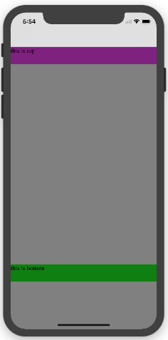
2.1 子元素页面固定在底部时;使用viewport-fit:cover时;可以看到bottom:0时只会显示在安全区域内;
* {
padding: 0;
margin: 0;
}
/*html,body {*/
/*height: 100%;*/
/*}*/
body {
background: grey;
padding-top: constant(safe-area-inset-top);
/*padding-left: constant(safe-area-inset-left);*/
/*padding-right: constant(safe-area-inset-right);*/
/*padding-bottom: constant(safe-area-inset-bottom);*/
}
.top {
width: 100%;
height: 44px;
background: purple;
}
.bottom {
position: fixed;
bottom: 0;
left: 0;
right: 0;
height: 44px;
color: black;
background: green;
}
添加html,body {width:100%;heigth:100%}
图1:
* {
padding: 0;
margin: 0;
}
html,body {
height: 100%;
}
body {
background: grey;
padding-top: constant(safe-area-inset-top);
padding-left: constant(safe-area-inset-left);
padding-right: constant(safe-area-inset-right);
padding-bottom: constant(safe-area-inset-bottom);
}
.top {
width: 100%;
height: 44px;
background: purple;
}
.bottom {
position: fixed;
bottom: 0;
left: 0;
right: 0;
height: 44px;
color: black;
background: green;
}
2.3 关于alertView弹框 遮罩层的解决方案
<!DOCTYPE html>
<html lang="en">
<head>
<meta charset="UTF-8">
<!--<meta name="viewport" content="width=device-width, initial-scale=1.0, minimum-scale=1.0, maximum-scale=1.0, user-scalable=no">-->
<meta name="viewport" content="width=device-width,initial-scale=1.0, minimum-scale=1.0, maximum-scale=1.0, user-scalable=no, viewport-fit=cover">
<meta http-equiv="pragma" content="no-cache">
<meta http-equiv="cache-control" content="no-cache">
<meta http-equiv="expires" content="0">
<title>alertView</title>
<script data-res="eebbk">
document.documentElement.style.fontSize = window.screen.width / 7.5 + 'px';
</script>
<style>
* {
margin: 0;
padding: 0;
}
html,body {
width: 100%;
height: 100%;
}
body {
font-size: 0.32rem;
padding-top: constant(safe-area-inset-top);
padding-left: constant(safe-area-inset-left);
padding-right: constant(safe-area-inset-right);
padding-bottom: constant(safe-area-inset-bottom);
}
.content {
text-align: center;
}
.testBut {
margin: 50px auto;
width: 100px;
height: 44px;
border: 1px solid darkgray;
outline:none;
user-select: none;
background-color: yellow;
}
</style>
<link href="alertView.css" rel="stylesheet" type="text/css">
</head>
<body>
<section class="content">
<button class="testBut" onclick="showLoading()">弹框加载</button>
</section>
<script type="text/javascript" src="alertView.js"></script>
<script>
function showLoading() {
UIAlertView.show({
type:"input",
title:"温馨提示", //标题
content:"VIP会员即将到期", //获取新的
isKnow:false
});
var xx = new UIAlertView();
console.log(xx);
}
</script>
</body>
</html>
精品好课

VUE是目前最火的前端框架之一,就业薪资很高,本课程教您如何快速学会VUE+ES6并应用到实战,教你如何解决内存泄漏,常用UI库的使用,自己封装组件,正式上线白屏问题,性能优化等。对正在工作当中或打算学习VUE高薪就...
2021年最新Vue2+Vue3+ES6+TypeScript和uni-app开发微信小程序从入门到实战视频教程,本课程教你如何快速学会VUE和uni-app并应用到实战,教你如何解决内存泄漏,常用UI库的使用,自己...
适用人群1、有html基础2、有css基础3、有javascript基础课程概述手把手教你如何开发属于自己的HTML5视频播放器,利用mp4转成m3u8格式的视频,并在移动端和PC端进行播放支持m3u8直播格式,兼容...
HTML5基础入门视频教程,教学思路清晰,简单易学必会。适合人群:创业者,只要会打字,对互联网编程感兴趣都可以学。课程概述:该课程主要讲解HTML(学习HTML5的必备基础语言)、CSS3、Javascript(学习...
React和VUE是目前最火的前端框架,就业薪资很高,本课程教您如何快速学会React和VUE并应用到实战,教你如何解决内存泄漏,常用库的使用,自己封装组件,正式上线白屏问题,性能优化等。对正在工作当中或打算学习Re...
React是前端最火的框架之一,就业薪资很高,本课程教您如何快速学会React并应用到实战,对正在工作当中或打算学习React高薪就业的你来说,那么这门课程便是你手中的葵花宝典。
jquery视频教程从入门到精通,课程主要包含:jquery选择器、jquery事件、jquery文档操作、动画、Ajax、jquery插件的制作、jquery下拉无限加载插件的制作等等......
React是目前最火的前端框架,就业薪资很高,本课程教您如何快速学会React并应用到实战,教你如何解决内存泄漏,常用UI库的使用,自己封装组件,正式上线白屏问题,性能优化等。对正在工作当中或打算学习React高薪就...